


Luciole: the typeface that’s specially designed for the visually impaired
The result of more than two years of collaboration between the French Regional Technical Center for Visual Disability (CTRDV) and the studio typographies.fr, Luciole (meaning firefly), is a real revolution for people with sight difficulties. This typeface offers optimal readability for all those affected by forms of visual impairment.
Optimized reading for people with sight difficulties
Luciole was designed to meet the specific needs of the visually impaired. This font, unique in its category, is composed of 700 signs for each of its variants (regular, bold, italic, bold italic) and allows visually impaired people to write their texts in almost all of the European languages. Greek and mathematical symbols are also available for scientific texts.
Intended to offer a comfortable and practical reading experience, Luciole has been conceived with a dozen specific design criteria in mind:
A unique collaboration that serves the visually impaired
Designed by the CTRDV and the studio typographies.fr, the typography Luciole has also received a grant from the Swiss Ceres Foundation and support from the DIPHE laboratory of the Lumière University Lyon 2.
Showcased at the second edition of the French National Accessible Digital Book Summit (Rencontres nationales du livre numérique accessible), Luciole has benefitted from the expertise of ophthalmologists, orthoptists, psychologists, transcribers and typeface designers.
The project has also served for various reading materials for visually impaired students.
Completely free, even for commercial use, the typeface Luciole is available to download. Users simply need to place the downloaded file in the Fonts file of their computer.
 |
|
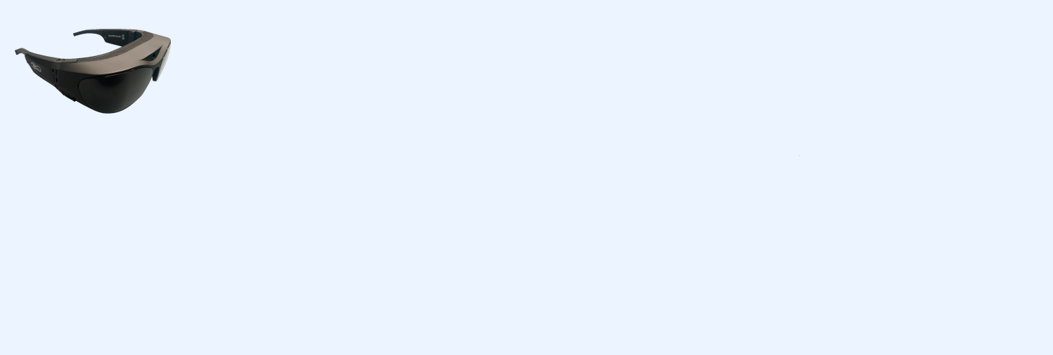
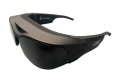
LOW VISION GLASSES
For patients with AMD.
|
 |
|
SETTINGS
Performed by a health professional. |
 |
|
CUSTOMER SERVICE
By email by |
Sign up to be notified when the glasses are available:
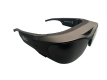

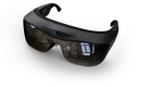


Light Vision Glasses for AMD patients
Light Vision develops glasses with eyetracking technology and control softwarefor AMD patients to improve their daily lives and give them back some autonomy.
FOLLOW-US!